In this blog post I will look at Visualization techniques that have made and are making a difference along with changing how we do things. Let’s start with a couple of stories from history and see how visualization techniques impacted major decisions.
Visualizing data helped the Allies during World War 2
Some years ago, I walked into Churchill’s War Rooms in London. My interest in visiting the war rooms came from my mother who grew up in the UK during World War 2. Mum survived the blitz in Portsmouth, home of the Royal Navy.
The closest call for Mum came on the 10th January 1941 when a bomb fell on the house next door, thankfully the Anderson Air Raid shelter protected the family from the flying debris.
Back at the war rooms, besides the amazement of the time capsule of the war rooms itself, I was surprised to see that Data Visualizations were alive and well and were used by Winston Churchill and the war cabinet in the 1940s.
There on the wall in all its glory were graphs and charts, describing units, manpower, enemy sizes, casualties and more.
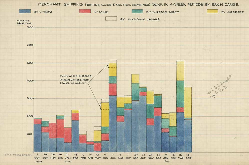
The information provided two valuable pieces of the jigsaw puzzle of war:
1. You could comprehend what was happening
2. You could make better decisions based on that information
One of the key underpinning successes of the war came from the collection of information and the ability to assess it and act upon it so. The visualizing technique helped comprehend information quickly.
Visualizing process information changed how we manufacture things today
Since World War 2 data visualizations such as graphs and charts have been dominant in shaping how we do things. Industry has benefited greatly from it.
As an example, Just-in-time (JIT) manufacturing, a method aimed primarily at reducing flow times within production, provided key information for improving response times from suppliers and to customers.
JIT reduces time across production and delivery along with removal of wastage and rework, keeping just the right amount of stock to meet demand.
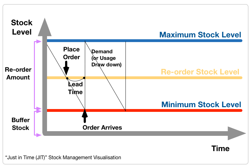
From its origin and development in Japan in the 1960s and 1970s. Western industry saw the value it provided and eventually it migrated to the west in the 1980s.
When people saw the charts and graphs, the data visualizations that showed what it improved, it was only a matter of time before it was adopted.
With the advent of the mainframe and personal computers, programs such as Batch spreadsheet report generator, IBM Financial Planning and Control System, VisiCalc, Lotus 1-2-3, Microsoft Excel allowed a person to take data, put into the spreadsheet and represent it graphically.
Infographics help us to Visualize Big Data
Since the 60s we’ve been storing lots of data. As we’ve gotten more proficient with tape and disk storage, we’ve stored more and more data. We’ve gotten to point of having mobile data centres in a container. All this data wherever its stored and access is better known as Big data. Big data is a rather broad term for larger data sets.

It was only a matter of time when technology provided the ability to look at data warehouses and the big data it stored then ask, “how can I display and use this information in a meaningful way?”
So the modern data visualization was born.
One of the main goals of Visualizing big data is to communicate information clearly and effectively through graphical means.
Now, to make it more interesting, let’s put this criteria on how we should deal with this big data and make it graphical:
• Make it functional – let the data tell the story
• Make it interesting to look at (aesthetics)
• Make it easy to read (intuitive)
So putting that into a formula we come up with this:
Functionality + Aesthetics + Intuitive = Infographic
Thus the Infographic was born: a graphical visual representation of information, intended to present information quickly and clearly.
“Infographics are becoming the new photographs for our time, they give a snapshot of information displayed in a simple to read picture”
Infographics are a type of visualization that allow people to quickly see what is really is going on.
Using infographics makes good sense, they make it easy to interpret information data, however they do come with some caveats.
Visualizing Infographics if not done right can be dangerous – “The emperors new clothes”
I have this niggling question about visualizing data infographics; how do you know what you’re seeing is telling the truth or am I just looking at a slick pretty picture?
Like the story of the Emperor’s new clothes being and thinking you got the greatest outfit but in reality you don’t have anything, infographics come with a similar challenge.
The pictures look really great but is there any validity to the data underneath? Go to Google images and search on infographics and you’ll get the eye candy experience.
It strikes me when I go to a number of websites with infographics they look really great, and that’s the problem, they look really great but is the information correct?
With the tools available in the marketplace on the PC desktop, the ability to be able to create great looking drawings, diagram and infographics is relatively easy, in other words, we can easily make “shiny objects”.
The challenge arises in that people are always attracted to the shiny object. They could be wooed by the look and feel of the infographic and not check the accuracy of the data and so it becomes the truth.
I came across a couple of articles that tell about a team of Belgian researchers that found that ’Human beings are attracted to glossy objects’.
‘However, the investigation of whether this preference for glossy is a systematic bias, and the rationale for why, has received little or no attention.’ ‘First and foremost, this paper shows that our preference for glossy might be deep-rooted and very human,’ say the authors.
Read more: hhttp://dailym.ai/1KOreTi and http://bit.ly/1M7jbxW
Translate this into a Infographic and we run the danger…
If it looks great it must be correct!” (I Hope)
People will always be wooed by the shiny object, rather than digging in deeper to validate the quality of the message behind the picture.
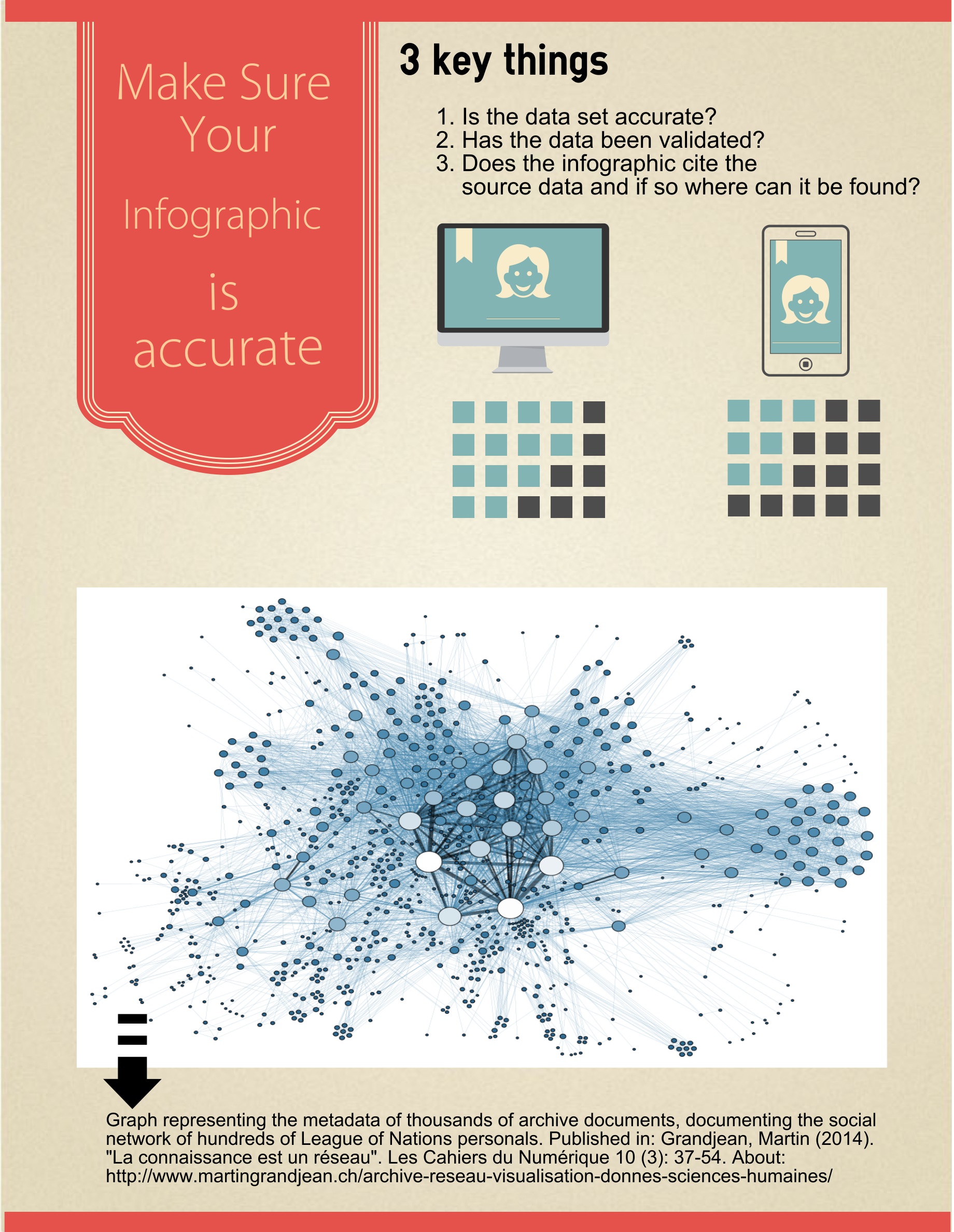
The best ways to address this is by asking some questions:
- Is the data set accurate?
- Has the data been validated?
- Does the infographic cite the source data and if so where can it be found?
The above image was created using a popular online tool for making Infographics. This is an example of ease of creating infographics.
Now the challenge is putting all the validation and crossing checking information into the Infographic. It’s probably going to spoil the look and feel. Maybe a shortlink may suffice.
Be warned, target audiences at presentations are usually well-educated and if they’re on the ball may ask, “how do I know this is telling me the truth?” If that’s the case, be well armed and have another “something” on hand to validate the pictures: a document, a reference guide, a handout or maybe a simpler infographic, to support the data.
If you’ve found a way to easily express the integrity of the data, then knock yourself out, go and create the greatest infographic to help get your message across.
That’s when a Visualization becomes a powerful tool in helping an audience understand a topic and possibly use that information to be better informed or make a better decision.
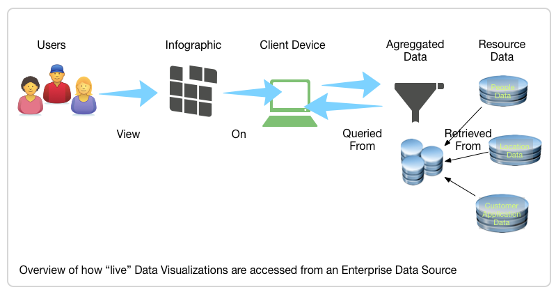
Visualization techniques improve the way we build and support Technology Systems.
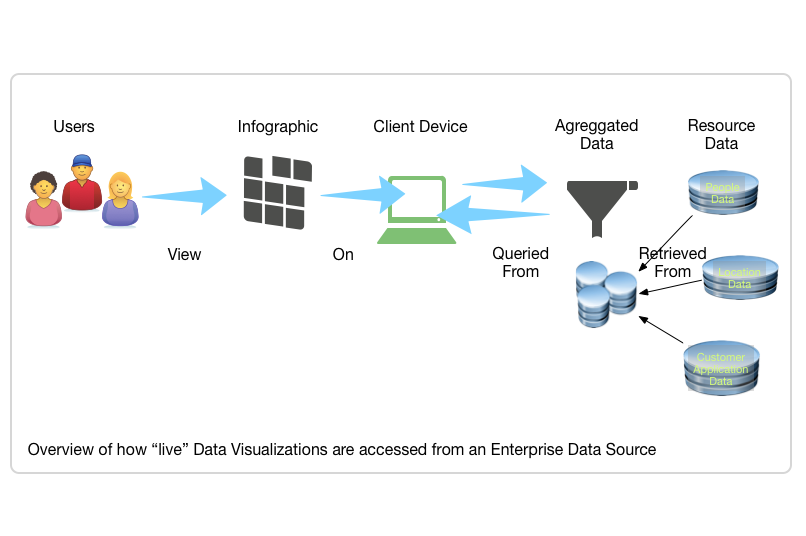
When we talk about visualizing data infographics, we’re showing a graphical multi-media or paper presentation to an audience of queried information extracted from a data warehouse.
When we talk about visualizations for building and maintaining technology systems, we’re talking about visualization techniques such as diagrams, drawings and presentations used in project management, business analysis, software development, testing, release management, and on-going support.
My research and observations show that not enough organisations use visualizations for this.
A general observation is there are lots of documents and, there are lots of individual diagrams inserted into those document, and there are lots of notations to support those diagrams.
If technology is going to elevate to new levels of innovation, development and growth, it will have to rely on the use Visualizations more effectively.
The power of using Visualization techniques such as diagramming for the development and support life cycle of technology is;
- Saving in delivering systems through time and resources
- Improving communication between project and support stakeholders
- Providing traceability in development and support history
Imagine a 100 page document outlining the requirements of an Information Technology system. What would happen if that document only needed 20 pages of textual content and one diagram to explain what is being built? Imagine the saving.
“If a picture paints 1000 words then why are we still writing 1000 words to build and support Information Technology Systems?”
My call today is for people and organisations to adopt an engineering approach to using more visualizations across the lifecycle of technology.
Technology practitioners need to adopt the zeal that the Data Visualization fraternity have when it comes to presenting their case through visualizing data infographics.
More visualizations help in creating an environment of innovation that improves the delivery of Information Technology Systems. The best architects and business analysts I have known all relied on using diagrams to maximise their efforts.
Organisations need to raise their capability maturity in this area.
In the last 400 years, human endeavour has been influenced greatly by the use of art, and drawings to capture what the eye sees and then allow people to build objects that influence how we live on this planet and leave this planet, in essence these are visualizations.
The secret is to use more diagrams, drawings and presentations in a way that an organisation can better deliver goods and services for its customers and itself now and into the future.